
Out of the weeds and into their hearts
Menlo Security
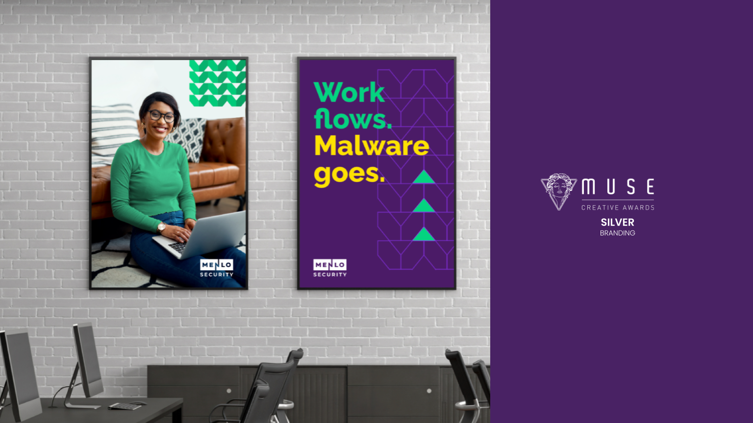
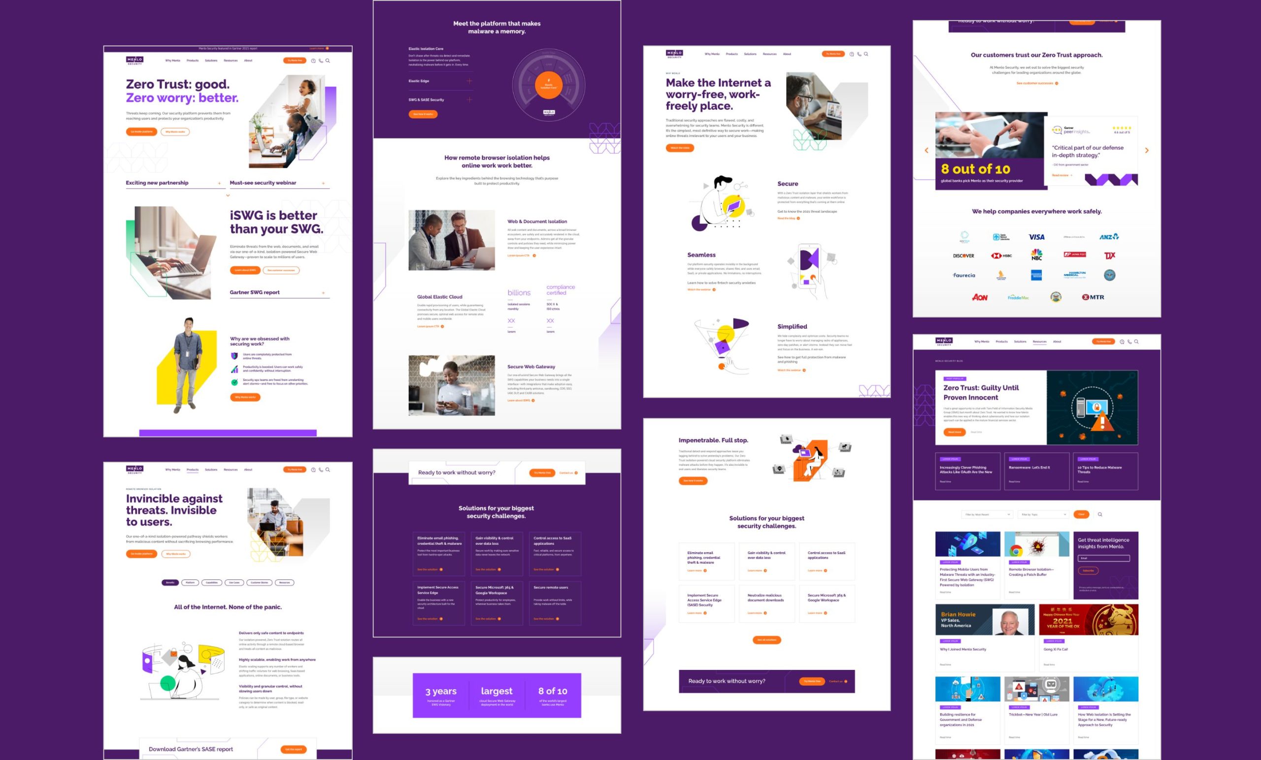
Menlo Security wanted to be viewed as a strategic security partner for large organizations, but a strong focus on their technology (isolation core) and tactical use cases (eliminate malware 100%) prevented them from up-leveling their messaging. We discovered that the biggest risk point for malware in a given company was individual workers. Many companies believed you had to lock down user access in order to fully secure applications and data. This was a false trade. With Menlo Security you could protect against threats while also protecting user productivity. So, “securing work” became the higher level idea for the brand – a focus on securing the work that people do everyday and allowing them to work without worry.
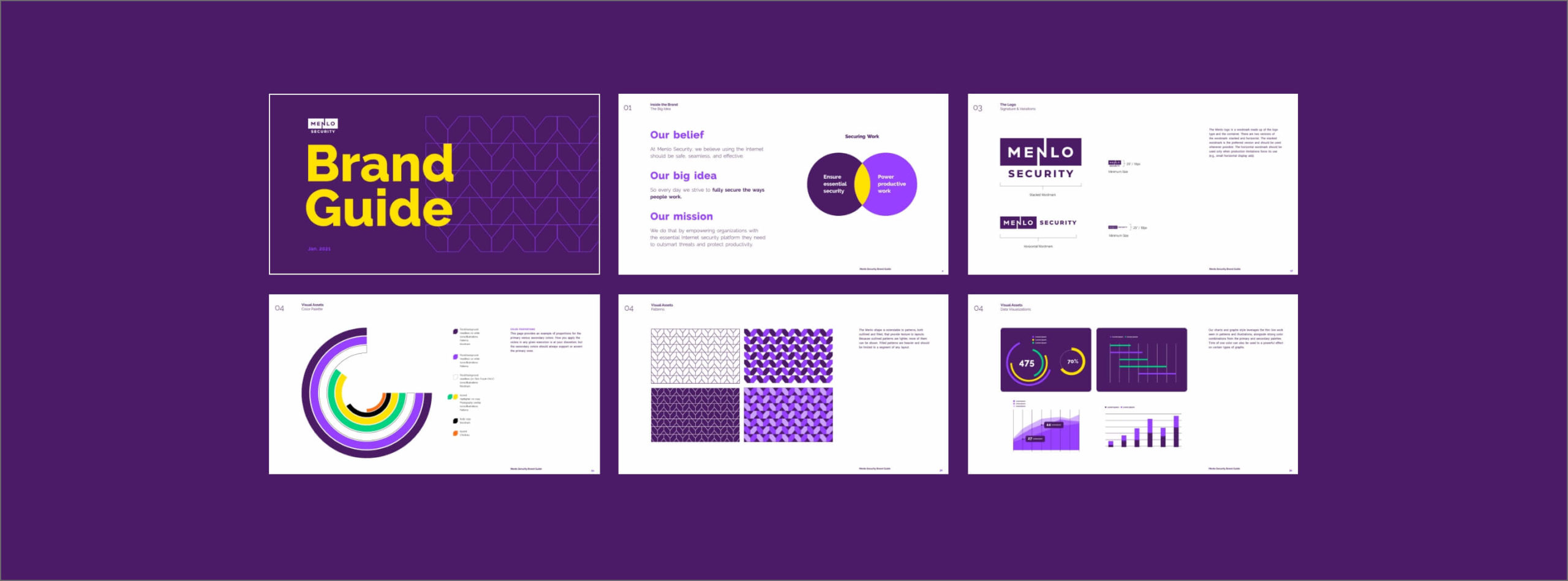
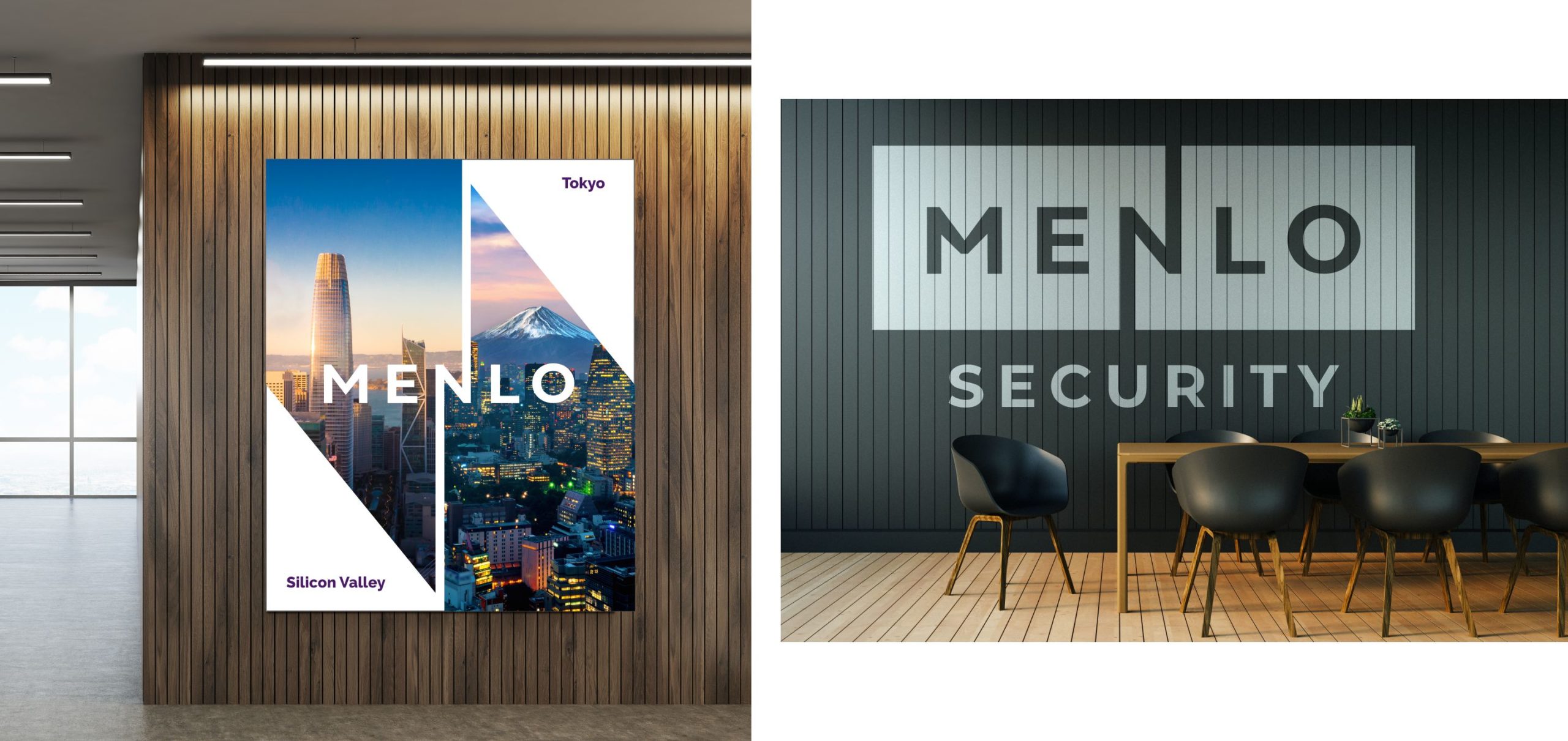
In terms of the visual identity, we evolved Menlo Security’s legacy light bulb logo to a more modern wordmark. The word splits into two parts, which speaks to Menlo’s isolation-powered technology platform. The lightning bolt shape of the “N” winks at the power of the platform.
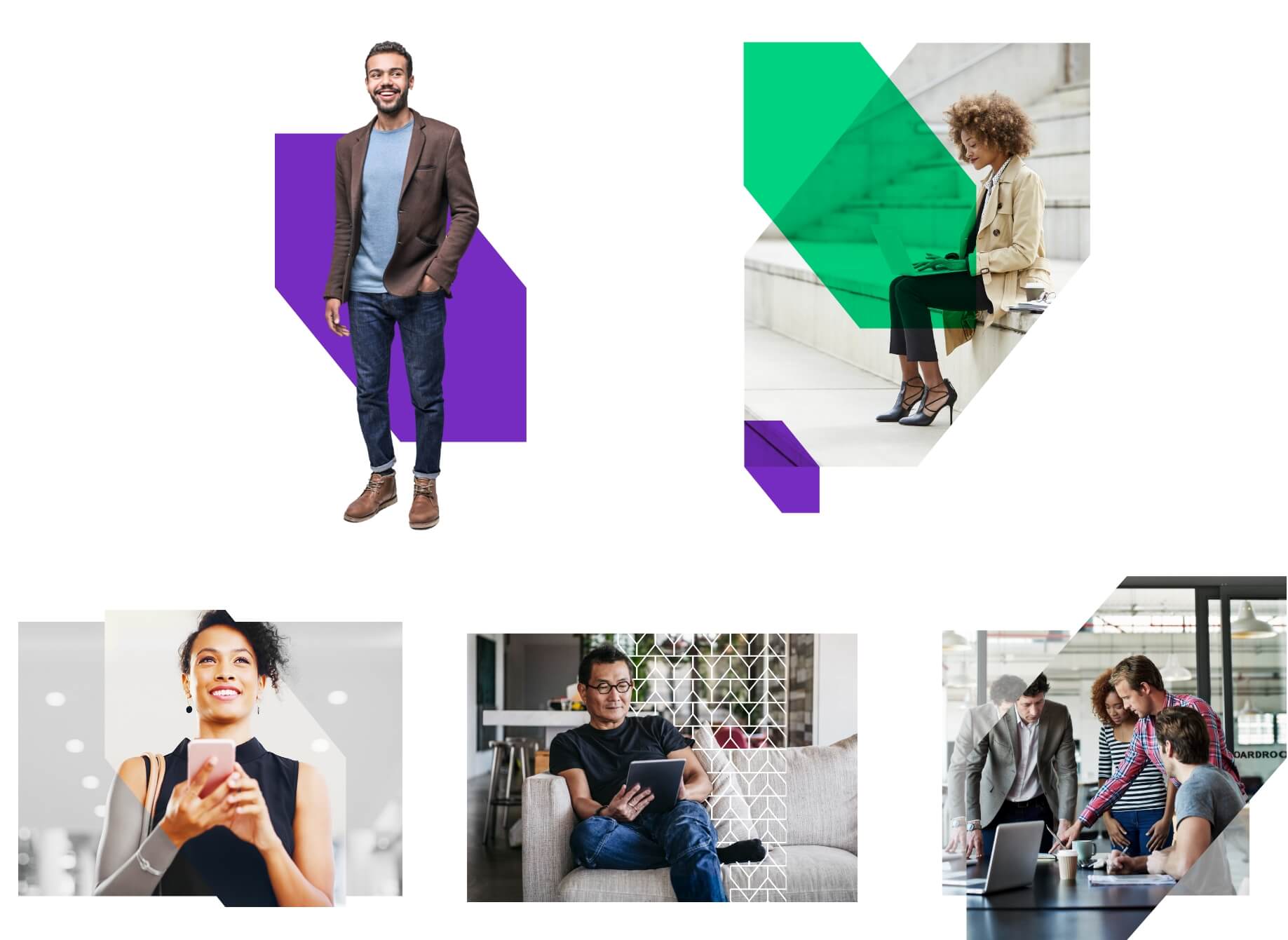
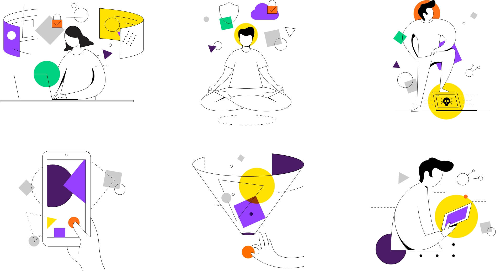
Rather than jump on classic security bandwagon visuals (cue eagles, hawks, owls, and falcons on dark backgrounds), we kept the brand light, modern, human, and friendly with colors not commonly used in the security space. This gave us a way to convey the concept of ease without having to say it.
The bold and direct voice also highlights a human (and modern) vibe with clever and inventive wordplay. Smart turns of phrase demonstrate Menlo’s intelligence (and respect for the audience’s intelligence, too). There is always a unique breeziness to the messaging that aligns with the idea of work without worry.
A huge step forward. I mean, HUGE!
-Menlo Investor
Ready to work with us – without worry?