BAY AREA RIDGE TRAIL
360° of Inspiration■
FINDING OUR LOCAL WILD
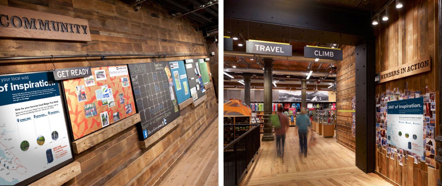
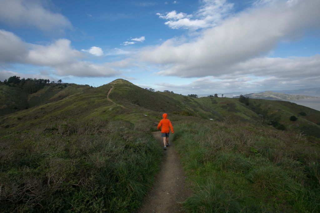
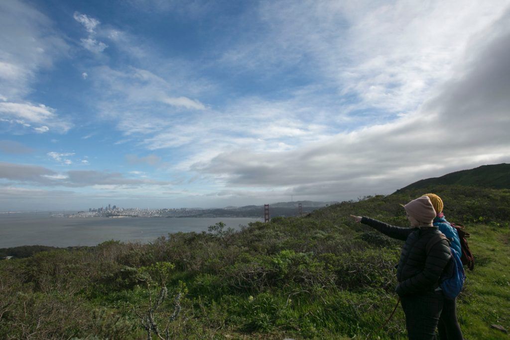
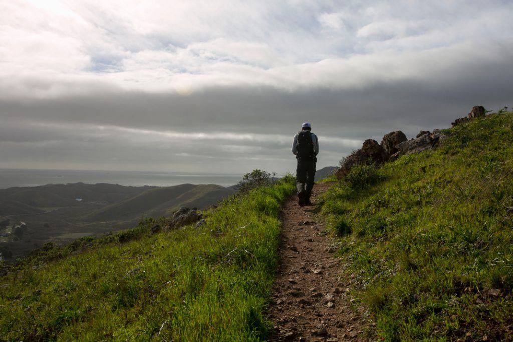
The Bay Area Ridge Trail traces the ridgeline above San Francisco Bay in a 375-mile (and growing) continuous loop. The Ridge Trail received a multi-year grant from REI Co-op as part of the company’s broader mission to invest in large, long-term projects that connect people and communities to the outdoors.
Under the REI Co-op grant, the Ridge Trail took aim at its existing, outdated website. In this digital world, reducing the barriers to life outside starts online – and for the Ridge Trail, that meant creating access to easily navigable trail maps, so that both experienced and amateur hikers could feel confident out on the trail. That’s where we came in.
SCOPE
- DISCOVERY
- STRATEGY
- WEBSITE
- WEB DEVELOPMENT
- ART DIRECTION
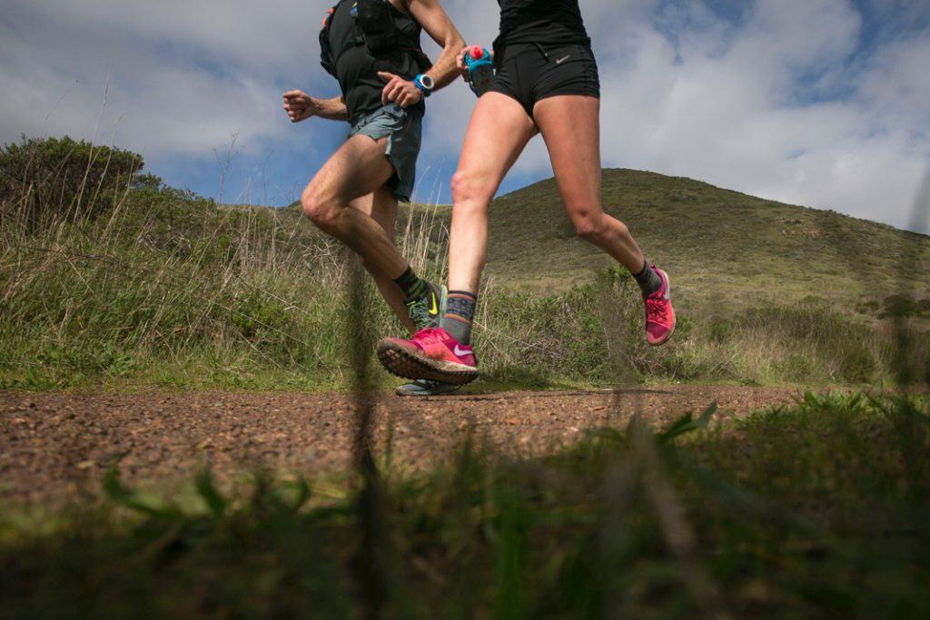
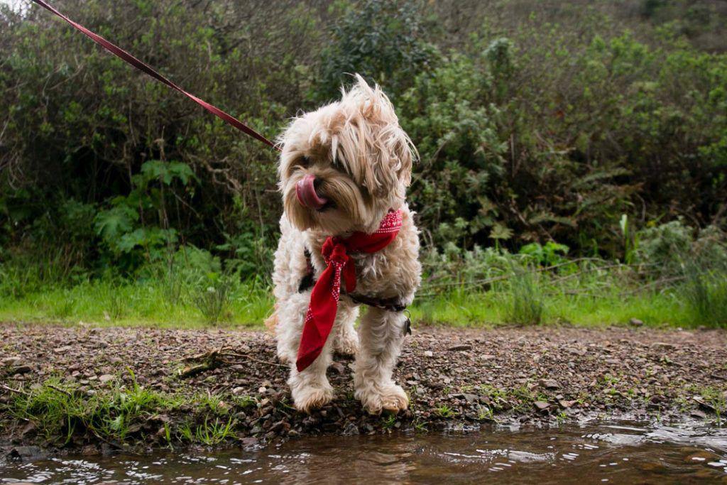
- PHOTOGRAPHY
- CONTENT CREATION
TWO SEPARATE GOALS. ONE MODERN SOLUTION.
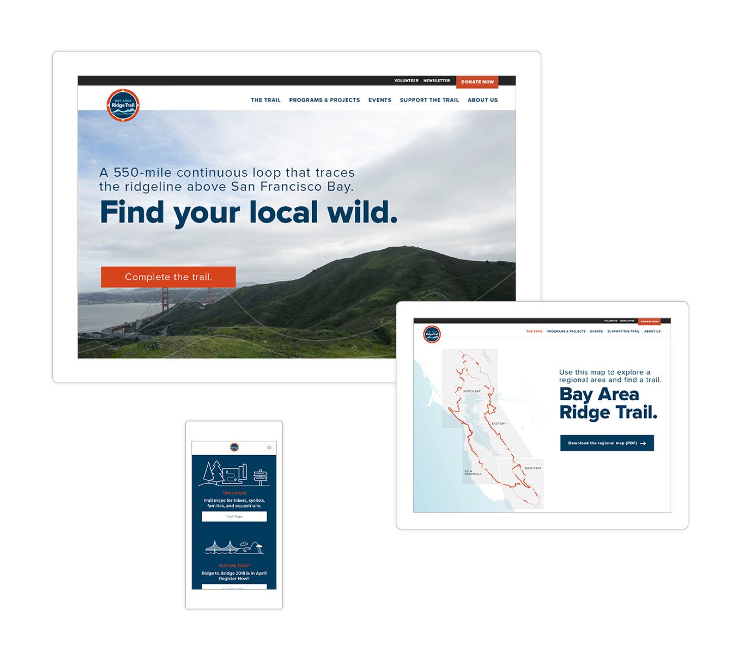
The Ridge Trail website presented a balancing act. It needed a modern site that would meet explorers’ needs for comprehensive trail navigation, and that would also meet the nonprofit’s need to drive donations and volunteers.
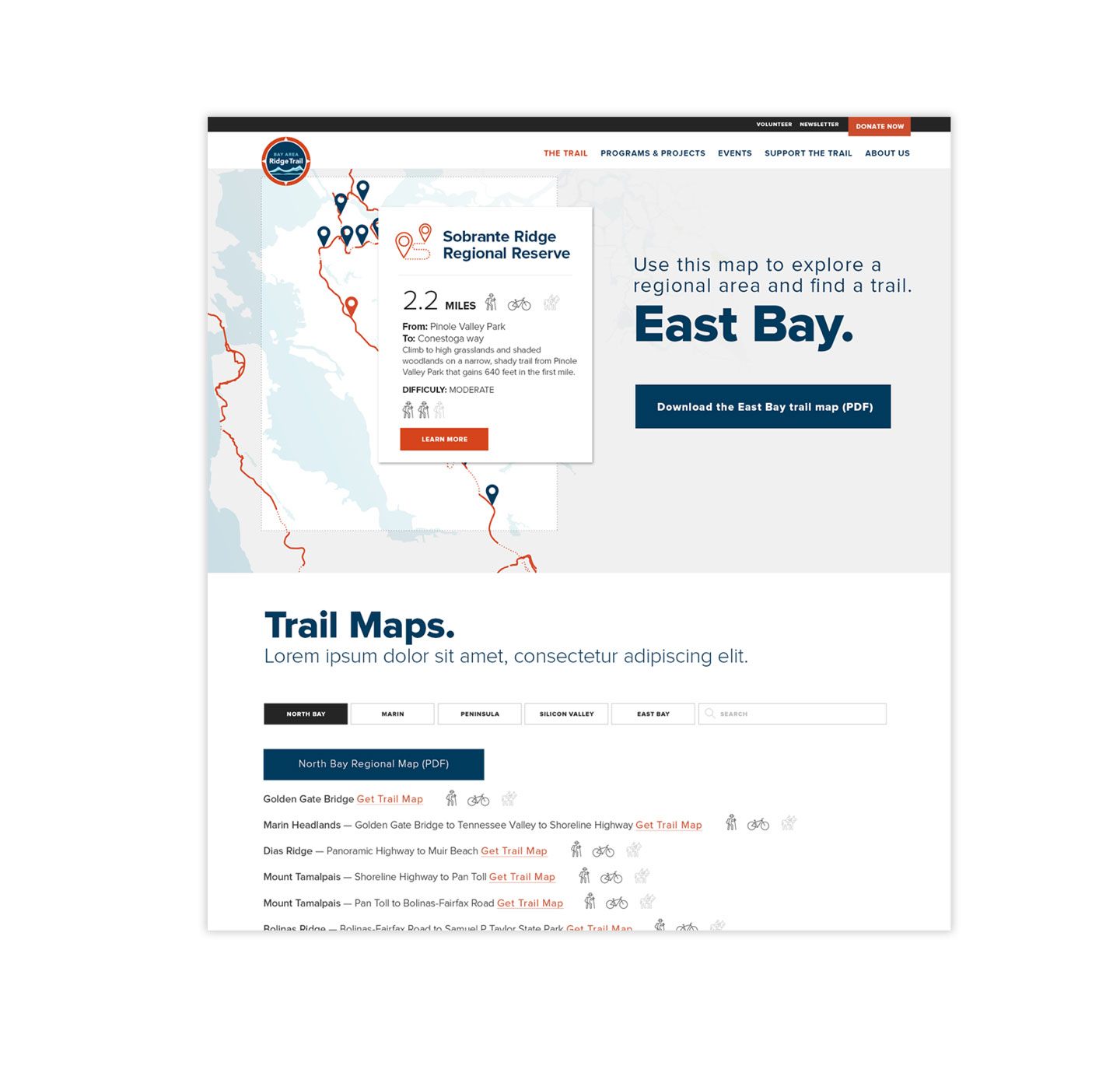
Key features of the redesigned site included the immersive, interactive map and the visually rich ability to search and download individual trail maps in every region of the trail’s 375 miles. Through dedicated pages and strategically placed callouts, we also gave people insight into Ridge Trail events and programs, with the intent of making them more invested in the success of the nonprofit.
FROM BLAH TO AH-HA
375 miles of trails. 1 website to
navigate them all.
MOBILE-FIRST & OPTIMIZED FOR SPEED
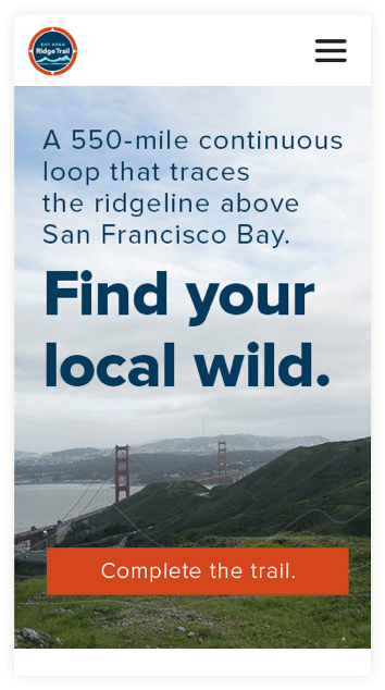
We all live on our phones these days, even when we’re exploring the great outdoors, so a fast mobile experience was a must. We made sure to maintain the immersive, interactive map experience, without sacrificing performance on various devices. After rigorous QA, we ended up with a site that looks great on a laptop at home – or on your phone over the Golden Gate Bridge.
FLEXIBILITY FOR AN EVER-CHANGING LANDSCAPE
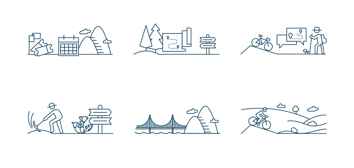
The Ridge Trail will eventually span more than 500 miles around the Bay Area, but it’s not there yet. That’s why we designed the website with Ridge Trail employees and volunteers in mind: Updates would be frequent, but needed to be as easy as possible – so we took advantage of widgets and APIs to refresh the site automatically.
Being an authentic brand with a real story truly resonates with people.
JANET MCBRIDE, EXECUTIVE DIRECTOR, BAY AREA RIDGE TRAIL
RESULTS
The Bay Area Ridge Trail website was awarded a Gold in the 2018 Muse Creative Awards.
Insights■
Strike gold with your own team.
Budgets can be limited – and even nonexistent – when working with nonprofits. Massive photo shoots and huge productions are out of the question, but you don’t need to spend a fortune when you have internal staff with those skills. A well-rounded creative team is priceless.
Follow the road less taken.
From websites to banner ads, brochures, or emails – every new project presents an opportunity to build on what was done before and to find faster, smarter, more creative, more interactive ways to engage our audiences.
Polished process, polished results.
When it comes to building the back end of a sophisticated, interactive mapping tool, hundreds of miles of trails and points of interest can mean hundreds of rows on spreadsheets. Emphasizing a smooth process from initial design to development to QA ensures that nothing gets lost along the way.
