ROLLWORKS
Always Be Connecting■
A NEW PLATFORM FOR NEW B2B NEEDS
An adtech innovator with a strong brand and a loyal following, AdRoll was entering a new market with a new product: a refreshingly honest platform for B2B. The challenge? The marketplace was crowded, noisy, and filled with customers burned by the hollow promises of AdRoll’s competitors.
Our job was manifold. First: Determine AdRoll’s brand hierarchy. Second: Generate names and logos for the parent company and the B2B entity. Third: Articulate the positioning and personality of the B2B entity. And finally, create a visual system to bring it all to life.
SCOPE
- BRANDING
- RESEARCH & COMPETITIVE AUDIT
- BRAND STRATEGY & POSITIONING
- NAMING
- IDENTITY & VISUAL LANGUAGE
- TONE OF VOICE & MESSAGING
- BRAND STANDARDS
- UX/UI DESIGN
- WEBSITE DEVELOPMENT
- E-COMMERCE
- SEO/OPEN GRAPH OPTIMIZATION

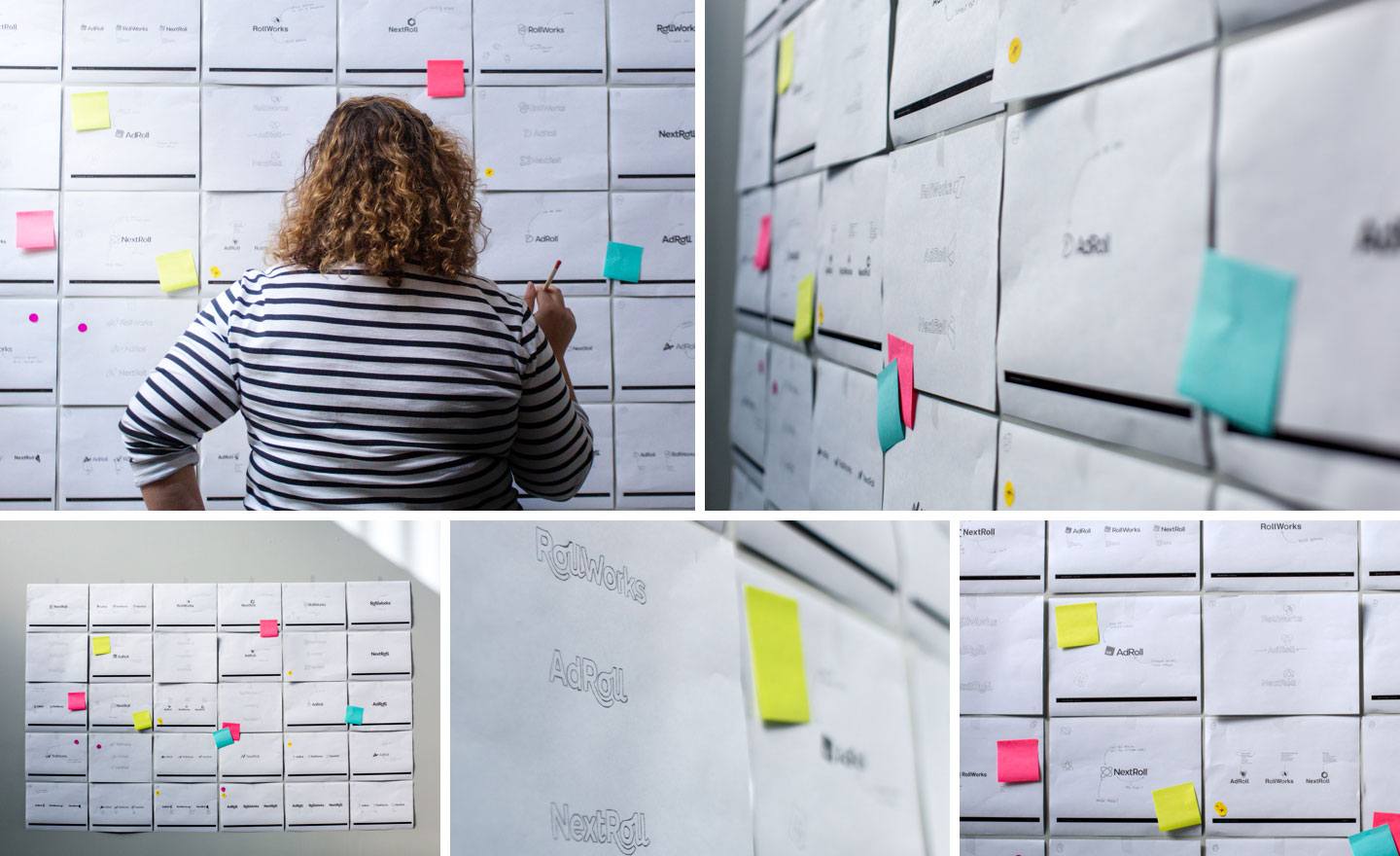
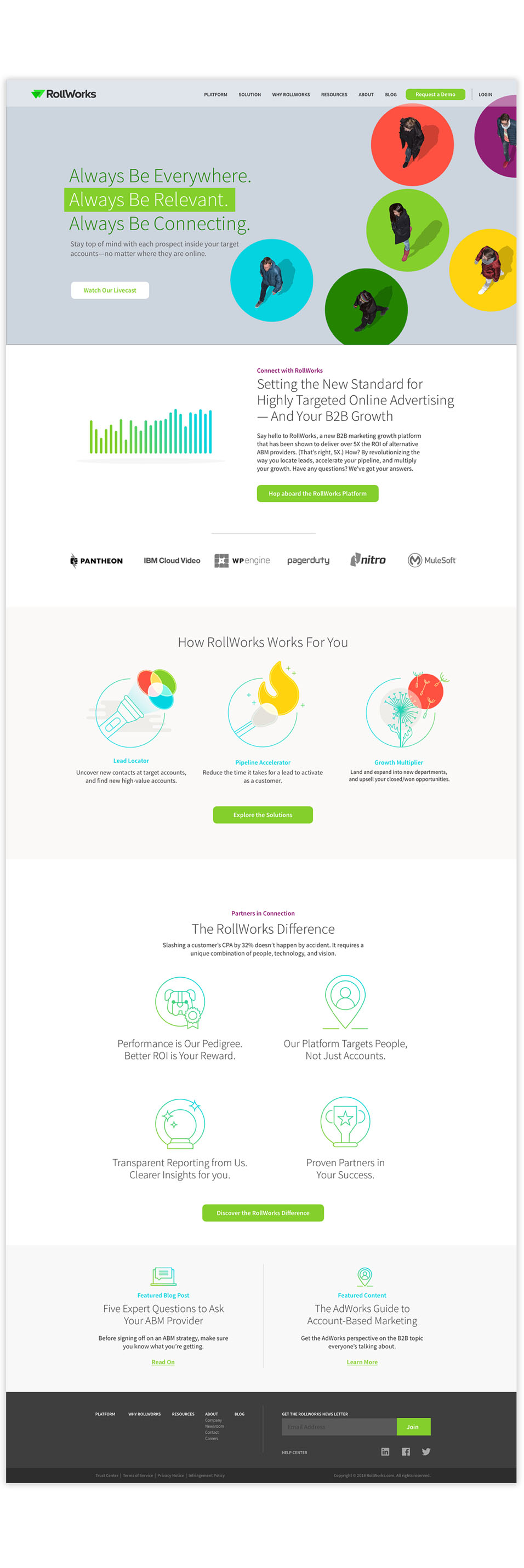
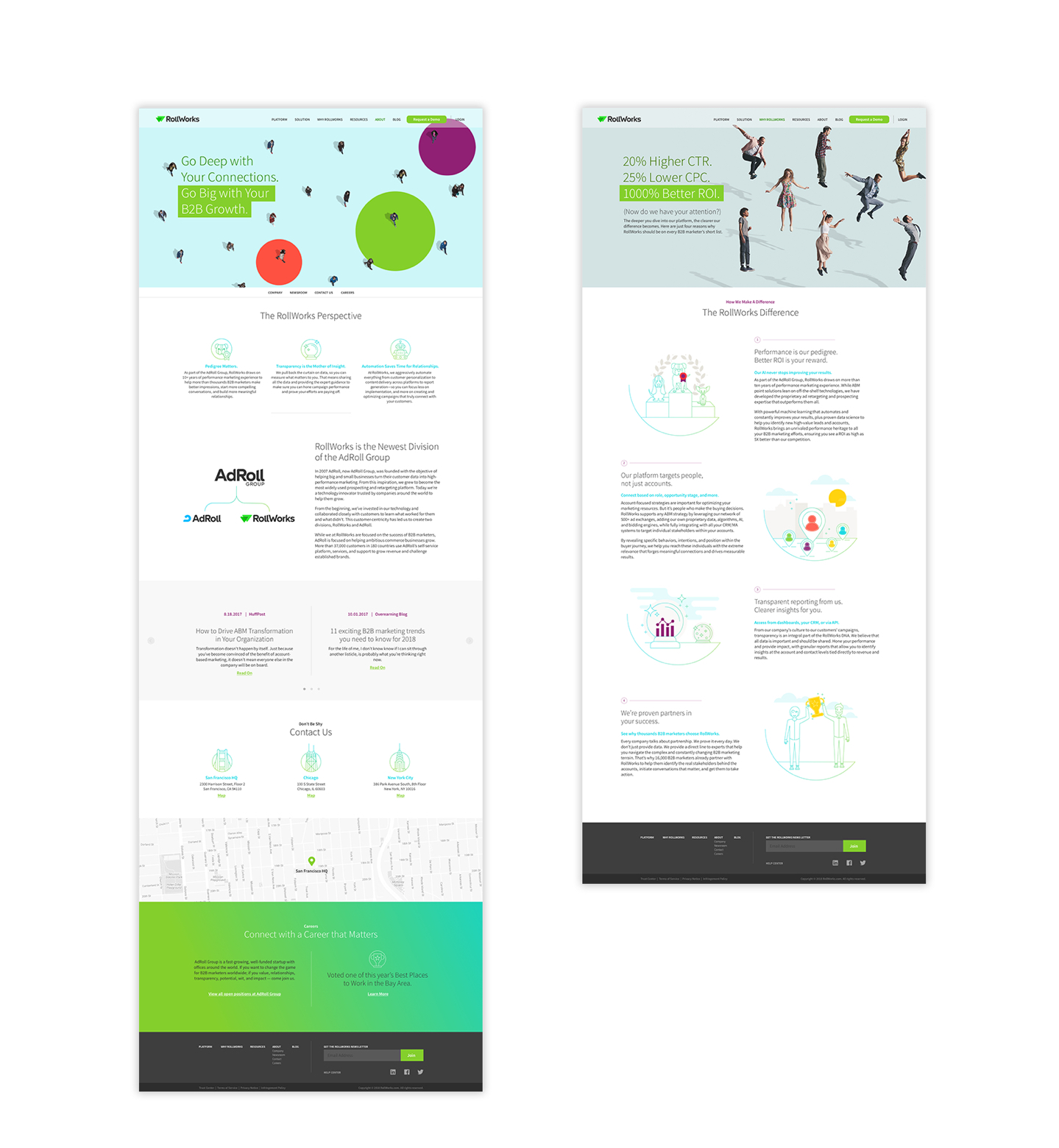
BUILDING A BRAND AS BELLWETHER
A brand is so much more than a logo. It places a stake in the ground, declaring guiding beliefs, operating values, a visual personality, and a tone of voice. Together, those elements act as a guiding light, giving companies a standard to hold themselves to and a unified front to present to the world. The brand we built for Rollworks had to capture everything they embodied and everywhere they were heading.
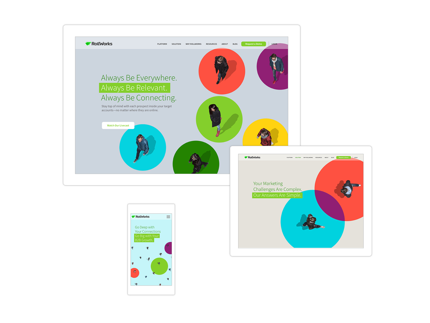
LAUNCH SITE

BYE-BYE BLAH
When your industry is plagued by smoke and mirrors, shine a light on the truth.
NAME. SET. MATCH.
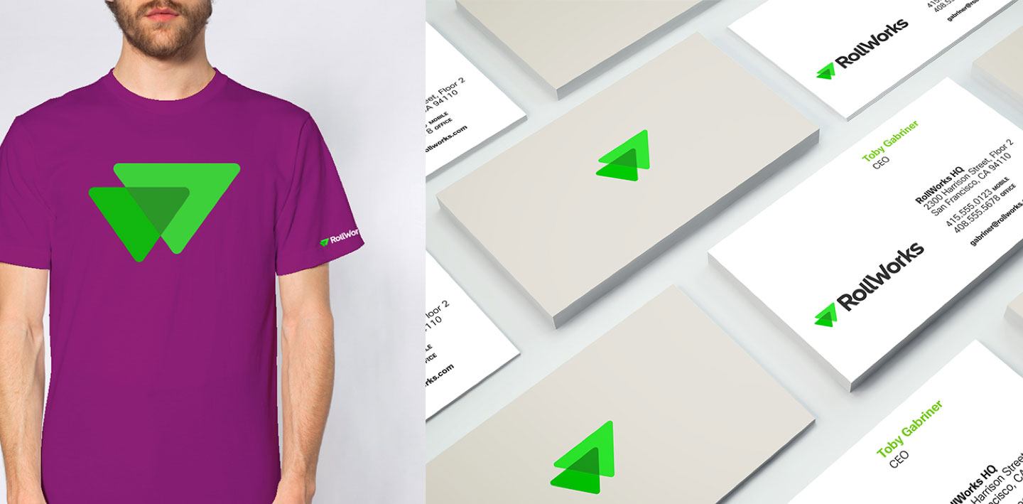
When we came aboard, the client had defined RollWorks as the new parent company name, but we saw RollWorks as perfect for B2B. Why? B2C customers already knew and understood the AdRoll platform, and “Works” had the echo of B2B within it.
WHAT’S IN A LEGACY?
Just how much influence should the legacy AdRoll brand have in the design of the new logos? Great question. Given that (a) the AdRoll brand had solid equity in the market, and (b) all the logos had to work together as a family, we stayed loyal to key elements of the existing AdRoll brand.
WINNER
The RollWorks website was awarded Best in Digital + UX Design in the GDUSA 2018 American Web Design Awards.
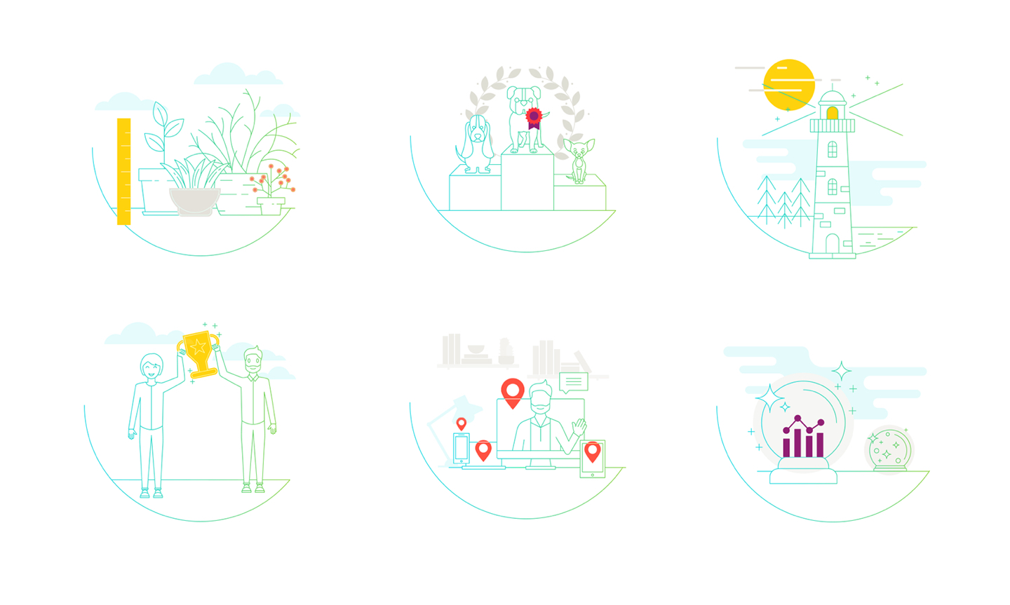
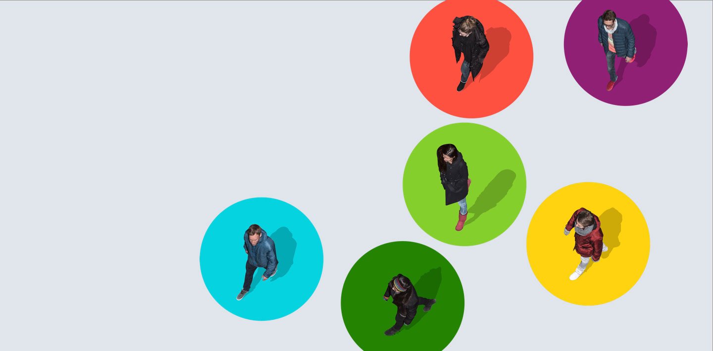
ICONS AND ILLUSTRATIONS
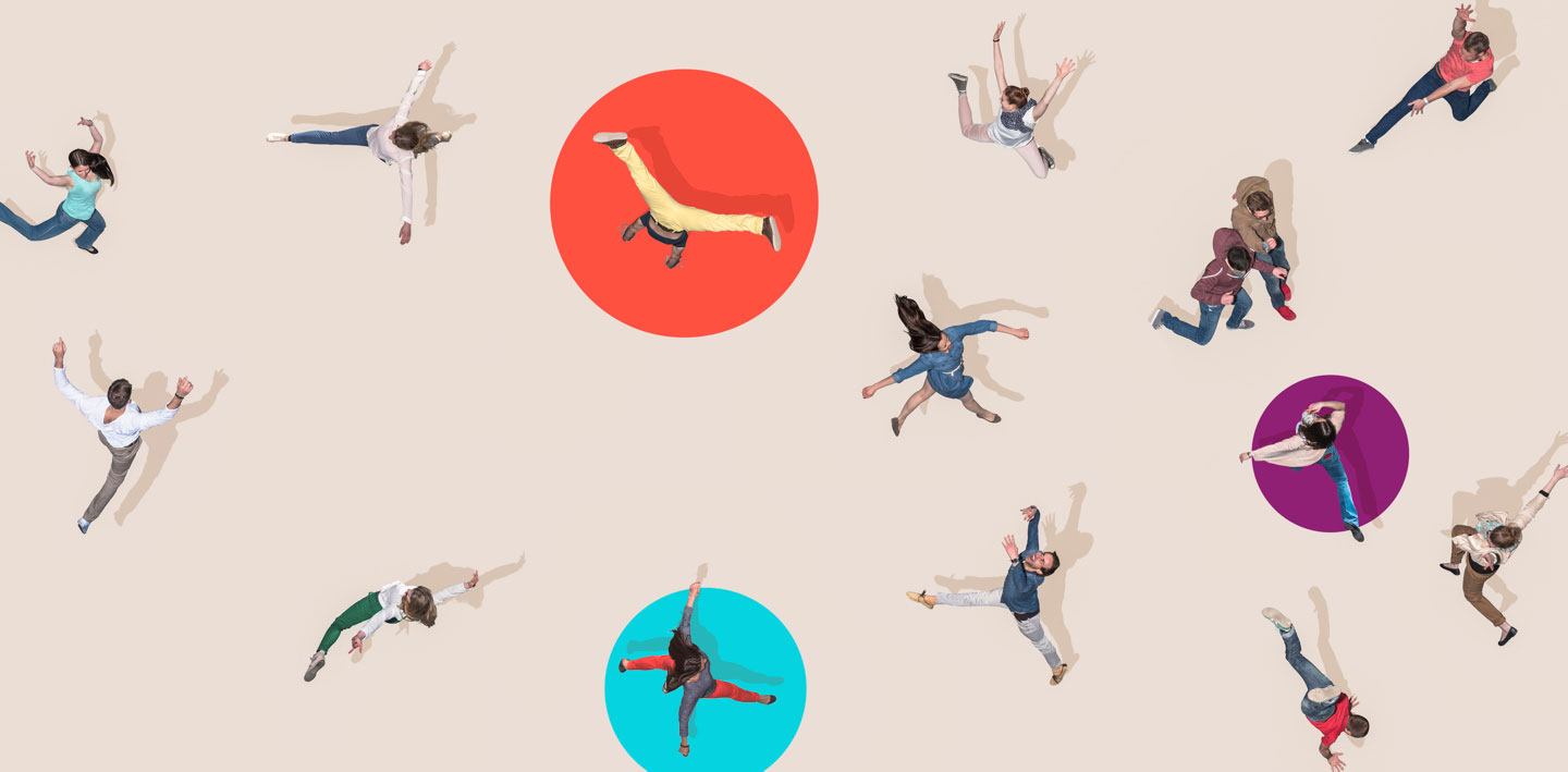
We opted for an illustration style that’s high-energy and positive with a hint of whimsy, avoiding clichés in favor of unique metaphors. When big things happen — wins, connections, and accomplishments — we use a light touch and a splash of sparkle.
Insights■
When your industry is plagued by smoke and mirrors, shine a light on the truth.
Adtech, unfortunately, is not known for transparency. Too many vendors made promises they couldn’t keep – or, worse, never intended to – and customers were jaded. But RollWorks built its brand on demonstrable performance and full transparency. We had to find a way to let those qualities shine through.
Don’t sell a tool. Sell the shed.
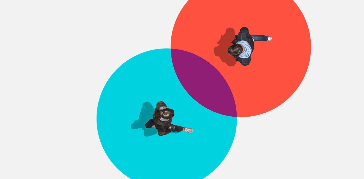
While most players in B2B adtech were pushing Accounts-Based Marketing, RollWorks understood that ABM was just one tool in the toolshed. Plus, their technology is more than just software; it’s connection – between Sales and Marketing, automation and CRM, front end and back end. The point? Show customers that RollWorks delivers groundbreaking ways to make those connections.
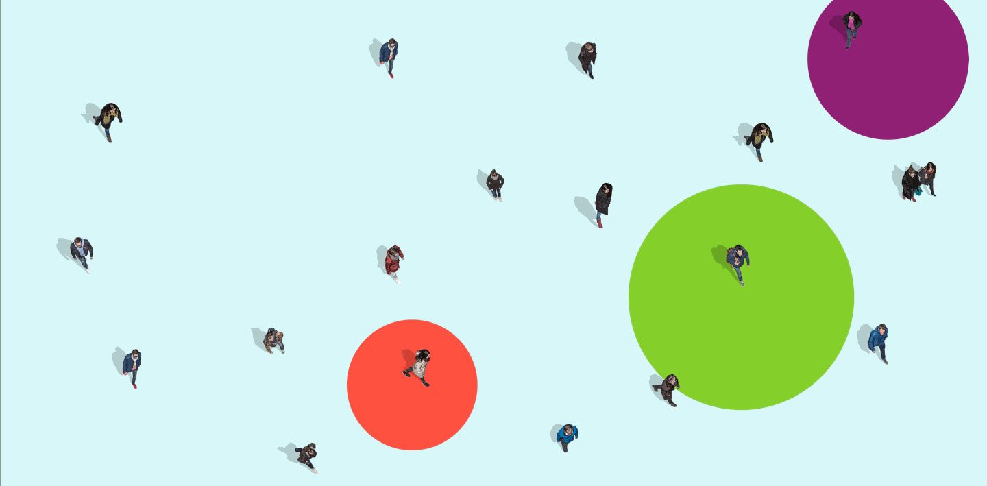
Find the white space in the color wheel.
In a crowded marketplace, standing out is a mandate. When building a brand identity, one way to establish difference is to map existing brands to the color wheel and look for areas that aren’t being used.